
wiseGraphic identity
Art direction
Illustrations
BRIEFING
The "Wise" programme is designed to empower women within our EMEA organisation by providing opportunities for professional development, mentorship, networking, and leadership training. The programme's inaugural year was successful in fostering a supportive environment and equipping participants with valuable skills. However, to further enhance its reach and recognition, we require a cohesive and compelling brand identity.
VISUAL CONCEPT
Representing the often-unheard voices of women in the workplace, now being brought to the forefront, WISE aims to make the invisible, visible. By amplifying these perspectives, we strive to create a more equitable and inclusive environment where every woman's contribution is recognised and valued.
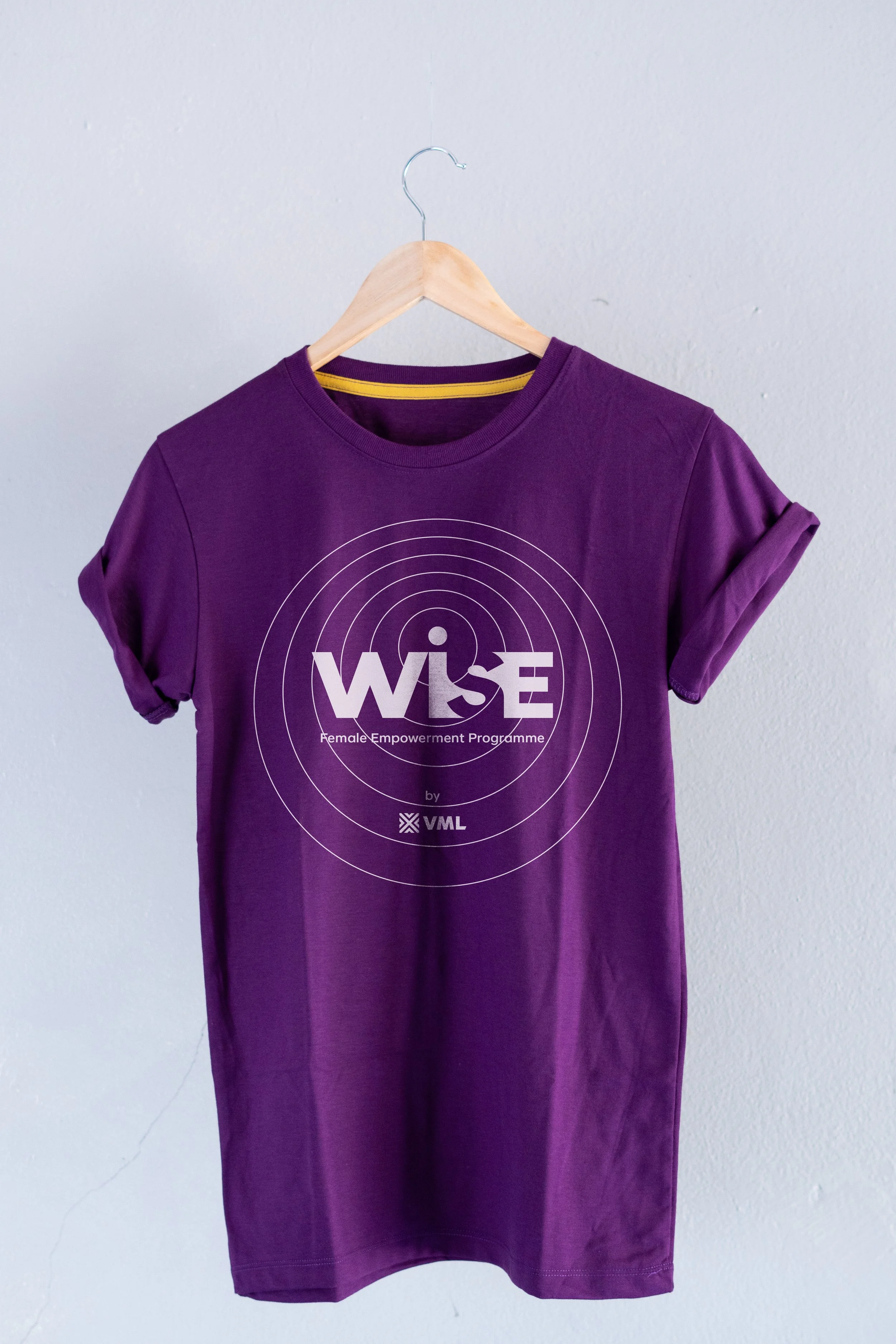
LOGO
The logo, built upon the strong VML typography, features a unique graphic element: the “S" is subtly manipulated to create a sense of disappearing and reappearing, by playing with the empty space between the letters
Also features a carefully placed dot above the capital "I." This seemingly small detail serves a dual purpose. First, it improves the legibility of the "I" within the bold, uppercase typography, ensuring quick and easy recognition of the brand name.


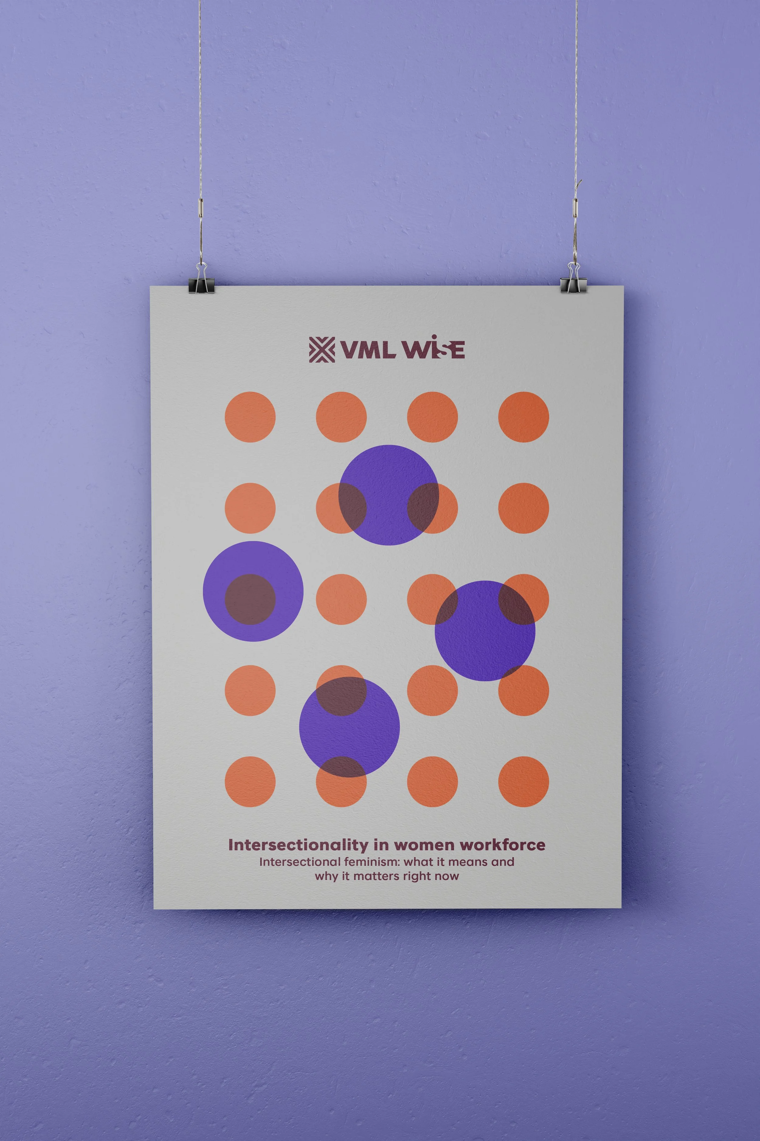
VISUAL SYSTEM
The second purpose for the "I" dot becomes a versatile design element, forming the basis for a variety of dynamic patterns used in brand backgrounds and other visual materials.
The Brand color palette, energetic and unapologetic, symbolize the strength, passion, and determination of women as they navigate and elevate their careers.
WISE is not just a program; it's a movement, visually declaring that women's voices will be heard and their contributions recognized


Related work

The Back Office. Branding & photography
Marzianos. Branding & packaging for a doughnut brand
La Dolcatina. Branding, packaging & photography