

The back officeStrategy
Design
Web
Home economist
Photography
BRIEFING
The client sought our expertise to craft a compelling brand identity for their catering business. This isn't your typical corporate catering; they specialize in delivering unique and adventurous gastronomic experiences. The branding needed to reflect their commitment to original food concepts and their dedication to creating memorable culinary moments carefully crafted to be both delicious and memorable, setting them apart from traditional catering options.
STRATEGY
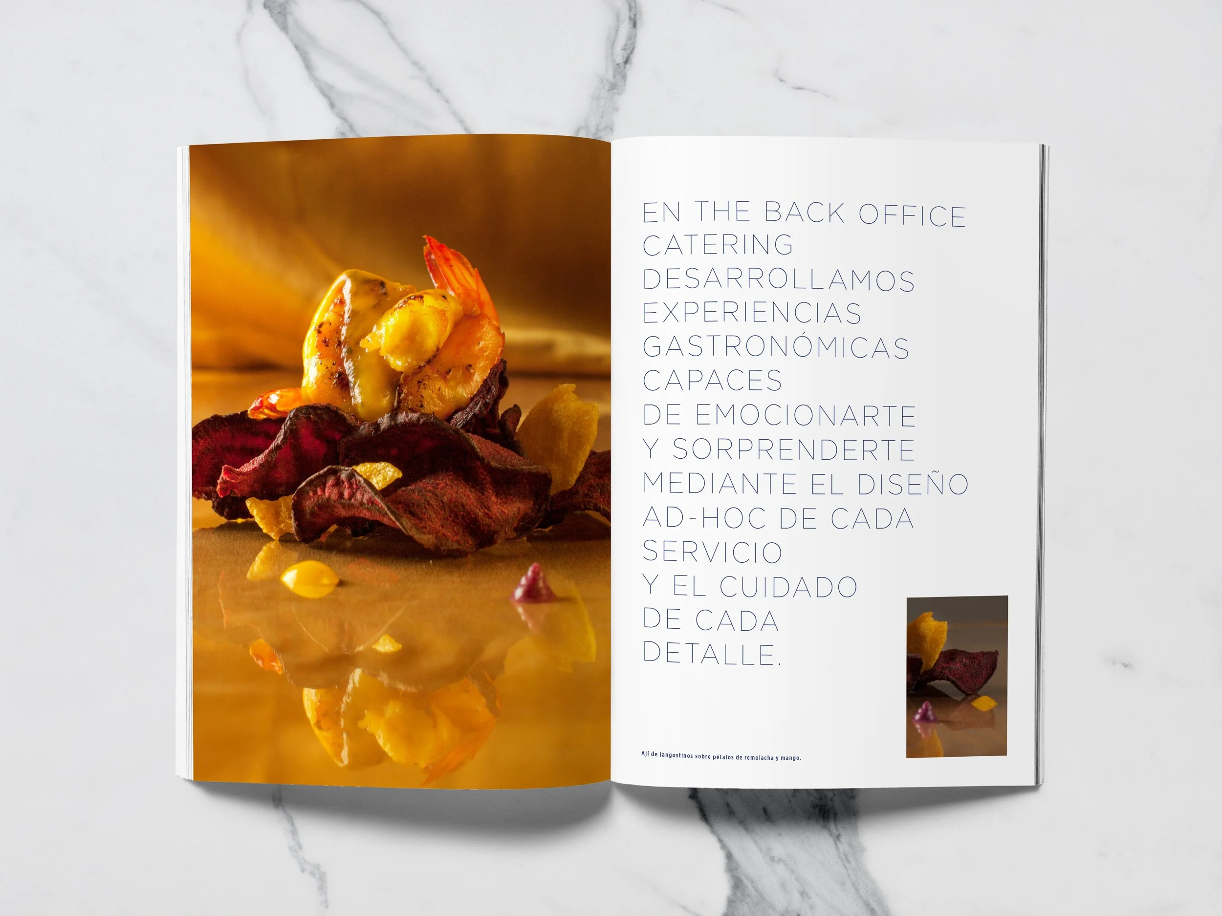
The brand strategy aimed to transform catering into an emotional and surprising experience. This was achieved by developing unique gastronomic concepts, delivered with personalized service and meticulous attention to detail. The owner's artistic background informed the boldness and sensitivity of these experiences, while an agile and professional approach simplified service management. By attentively listening to each company's needs, they ensure every detail aligns perfectly with their expectations. Inspire, delight and ease are the three values for the brand, that roots directly into the main aspirations of the company.

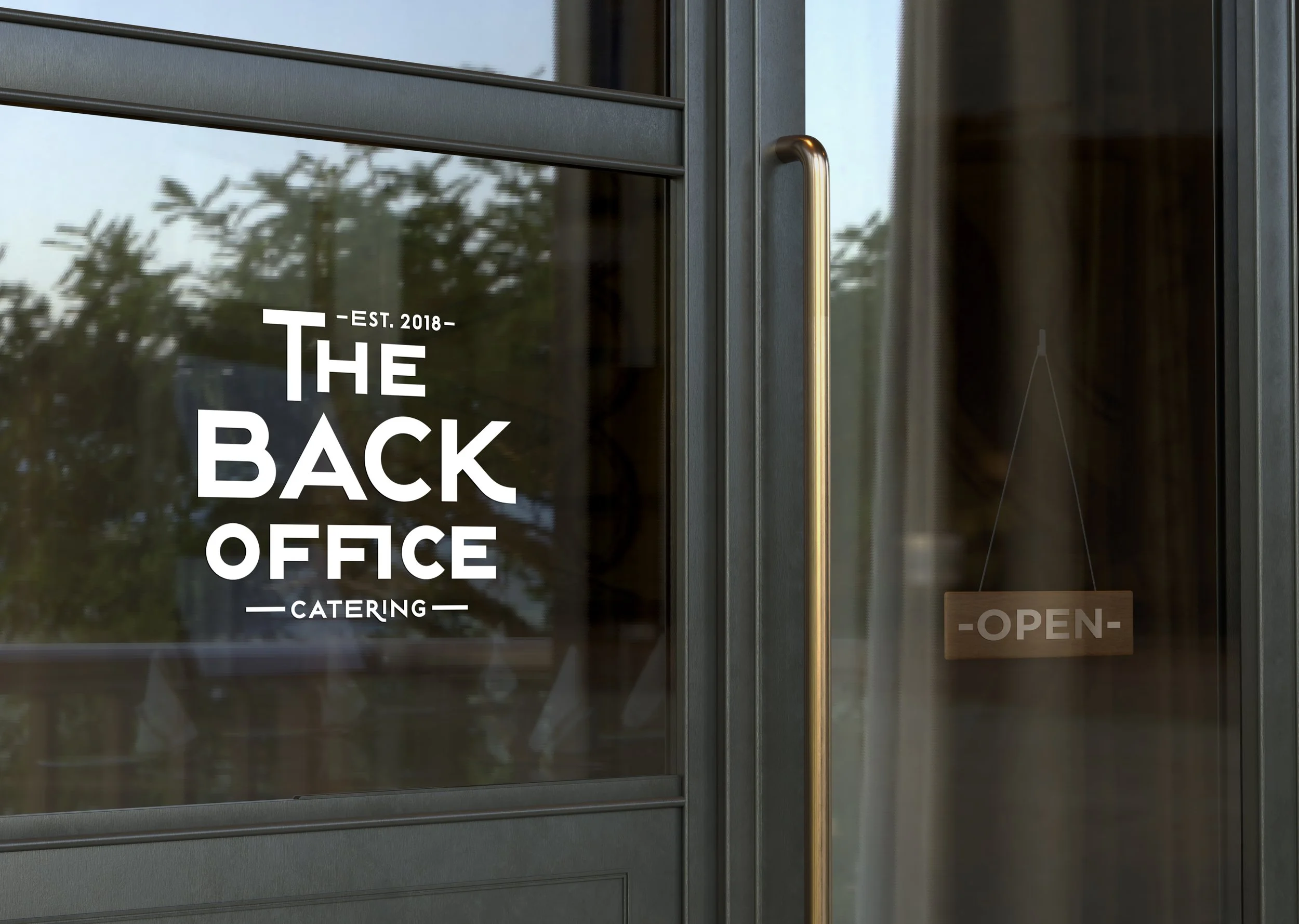
LOGO

The logotype is a powerful visual representation of The Back Office's brand identity. Its bold typography and compact design communicate boldness and daring, reflecting the company's core values. This fearless approach is not merely aesthetic; it's deeply ingrained in their culinary approach. They are committed to pushing culinary boundaries, experimenting with innovative techniques, and delivering unforgettable dining experiences that surprise and delight their customers.


VISUAL CONCEPT
The visual concept is a sophisticated blend of influences, drawing inspiration from the owner's background in furniture restoration and a strong embrace of Art Deco aesthetics. This iconic style, known for its geometric patterns, bold lines, and luxurious materials, is reflected throughout the brand's visual language. The rich color palette of intense dark blue and gold evokes a sense of luxury and timeless elegance, reminiscent of the Art Deco era's glamour. The distinctive typography, carefully selected to complement the overall aesthetic, further reinforces this connection, creating a unified and memorable brand identity.


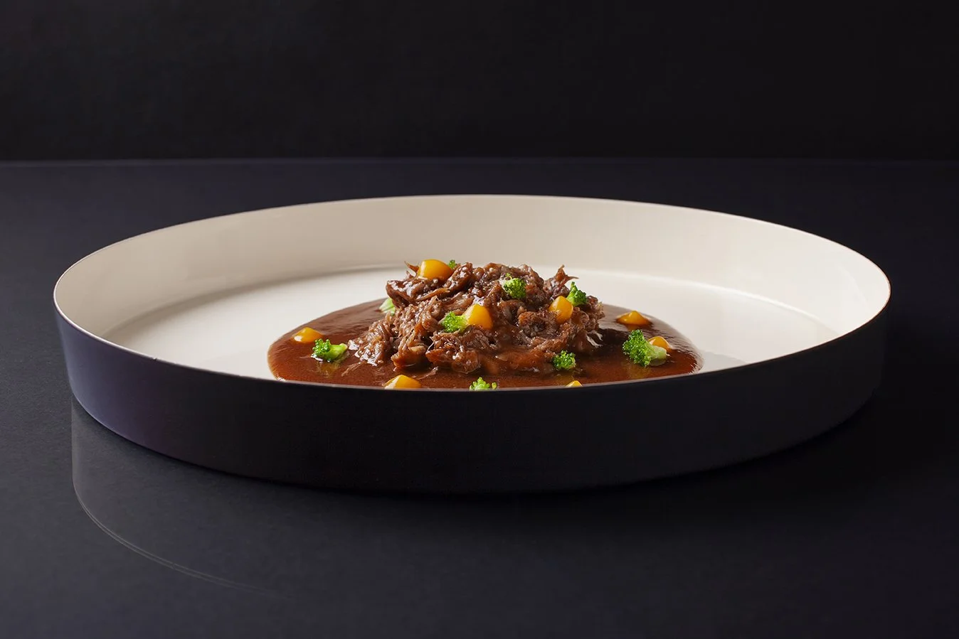
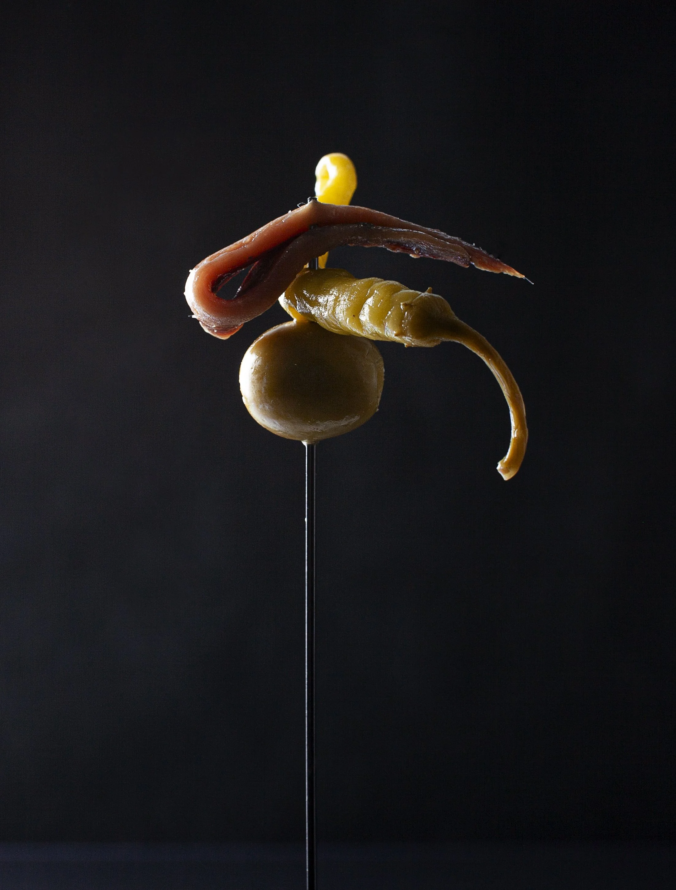
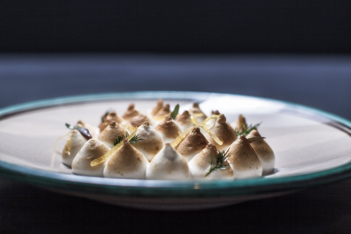
PHOTOGRAPHY
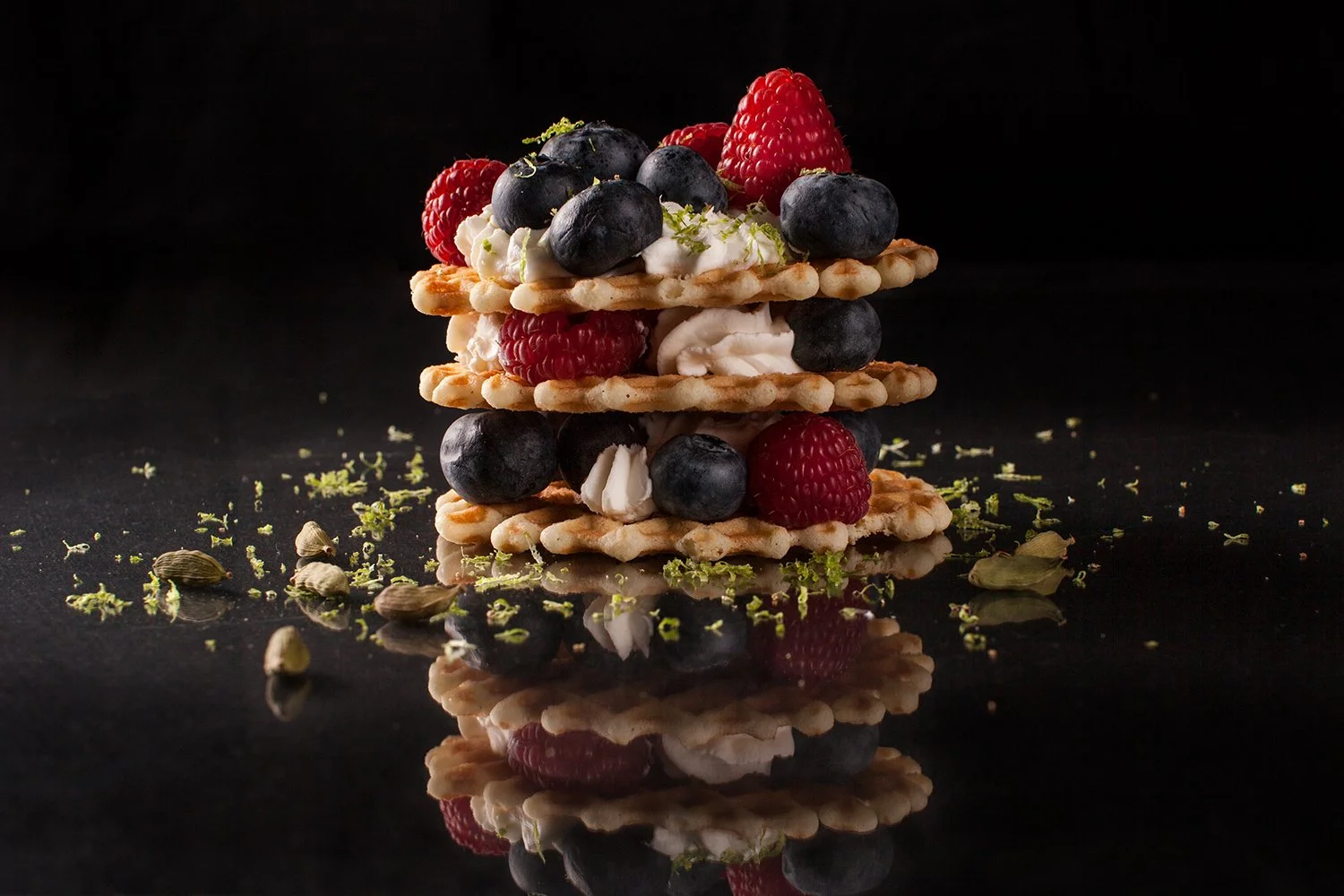
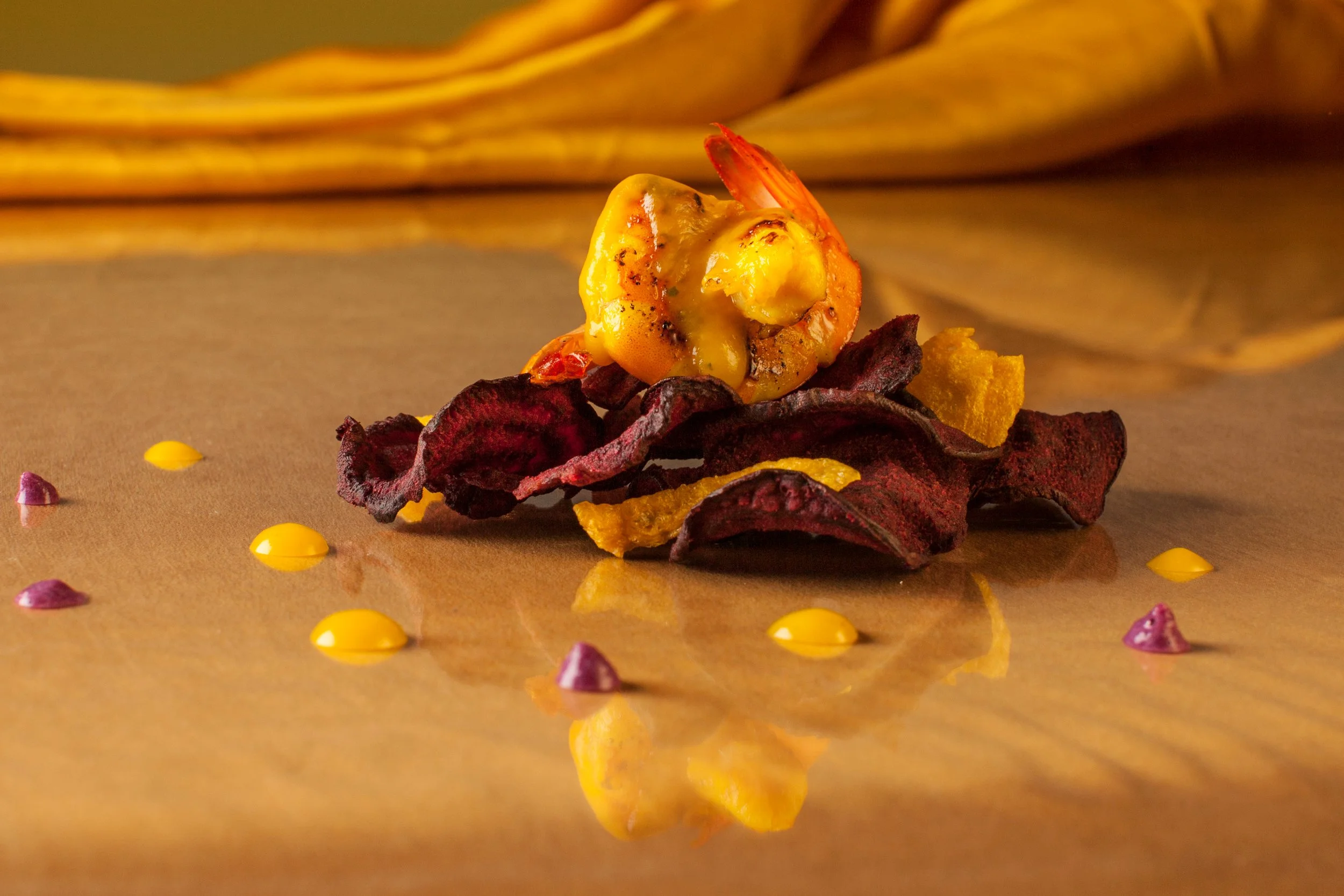
Inspired by the dramatic chiaroscuro of the Baroque era, the art direction for the photographic session aimed to evoke a sense of lushness, opulence, and juiciness. This was achieved through a carefully curated home economy, integrating dressings and sauces from the recipes as artistic accents, almost like brushstrokes on a canvas. Textured backgrounds, created with a variety of fabrics, added further richness to the composition. The food was positioned on a transparent film to create the impression of being directly placed on the fabric, enhancing the tactile appeal. Soft, directional lighting and deep shadows further emphasized the depth and dimensionality of the scene.


Related work

Marzianos. Branding & packaging for a doughnut brand
Photography
La Dolcatina. Branding, packaging & photography